[R] Plotting results from extRemes package - Extreme Value Analysis
If you are familiar with Extreme Value Analysis (EVA) in R you will have likely come across the extRemes package, written by Eric Gilleland.
The package’s main function, ‘fevd()’, fits an extreme value distribution to data. Methods for plotting are available for objects of class ‘fevd’ to produce diagnostics and result plots, such as a return level plot.
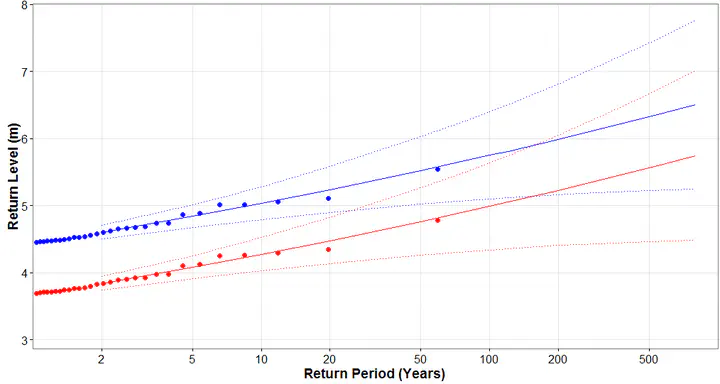
My issue is the restricted control you seem to have over the plot’s layout and general look. You can choose which plots to show, or to add a custom title, but not much else. What if you want to customise the plot to your liking, plot the results in another software/package or display two EVAs on the same figure as shown above?
I could not find an easy way to extract the information the package uses to generate the plots, nor could I find any mention of this problem online. In the off-chance someone is in the same situation, you’ll find a solution below. It seems a little awkward to me and if there is a better way that I am missing, please do let me know!
Let’s use the data from the “extRemes” package, with the example for the Peaks Over Threshold approach:
library(extRemes)
data("damage", package = "extRemes")
fitD <- fevd(Dam, damage, threshold = 6, type = "GP", time.units = "2.06/year")
plot(fitD, type = "rl")
You have to play with the original code for the package’s plot functions. When using the Maximum Likelihood Estimation (MLE) method, the function to change is ‘plot.fevd.mle’. If you are satisfied with the overall default aspect of the plots and just need to tweak it you can customise the code and reload the function. However, I generally use ggplot2 to produce my figures and like to have a consistent template.
Once you have your ‘fevd’ object you will get the information you need to draw a Return Level plot with the following two functions (other types of plots and distributions will use a different section from plot.fevd.mle).
The first returns a dataframe of return level point coordinates:
getrlpoints <- function(fit){

xp2 <- ppoints(fit$n, a = 0)
ytmp <- datagrabber(fit)
y <- c(ytmp[, 1])
sdat <- sort(y)
npy <- fit$npy
u <- fit$threshold
rlpoints.x <- -1/log(xp2)[sdat > u]/npy
rlpoints.y <- sdat[sdat > u]
rlpoints <- data.frame(rlpoints.x, rlpoints.y)

return(rlpoints)
}
The second returns a dataframe of estimated returned levels with confidence intervals:
getcidf <- function(fit){

rperiods = c(2, 5, 10, 20, 50, 80, 100, 120, 200, 250, 300, 500, 800)
bds <- ci(fit, return.period = rperiods)
c1 <- as.numeric(bds[,1])
c2 <- as.numeric(bds[,2])
c3 <- as.numeric(bds[,3])
ci_df <- data.frame(c1, c2, c3, rperiods)

return(ci_df)
}
That is all you need to produce the plot in ggplot2:
library(ggplot2)

rlpoints <- getrlpoints(fitD)
ci_df <- getcidf(fitD)

ggplot() +
  geom_line(data = ci_df, aes(x = rperiods, y = c2), color = "red") +
  geom_line(data = ci_df, aes(x = rperiods, y = c1), color = "grey") +
  geom_line(data = ci_df, aes(x = rperiods, y = c3), color = "grey") +
  geom_point(data = rlpoints, aes(x = rlpoints.x, y = rlpoints.y), size = 1) +
  ylab("Return Level (m)") +
  xlab("Return Period (Years)") +
  scale_x_log10(expand = c(0, 0), breaks = c(2,5,10,20,50,100,200,500)) +
  theme_bw() +
  theme(axis.text = element_text(size=12), axis.title = element_text(size = 14, face = "bold"))
Ulysse Pasquier
Researcher in Hydrology and Climate Change Adaptation
My research focuses on the impacts of climate change and human activity on hydrology and water resources.