[R] Incidence of Thyroid Cancer in post-Chernobyl Belarus - Making an Animated Map
HBO’s latest mini-series Chernobyl is both haunting and gripping in retelling the events that followed the night of April 26th 1986. The show is not only a fascinating window into the Soviet world that once was, it also serves as a contemporary reminder of “what is the cost of lies”, to quote the final episode’s ultimate line.
The explosion of the Chernobyl Nuclear Power Plant’s reactor 4 was an environmental and human disaster that impacted countless lives across Europe. Children in neighbouring countries at the time of the incident were particularly affected by the emitted radiation, with rates of cancer increasing in the following years.
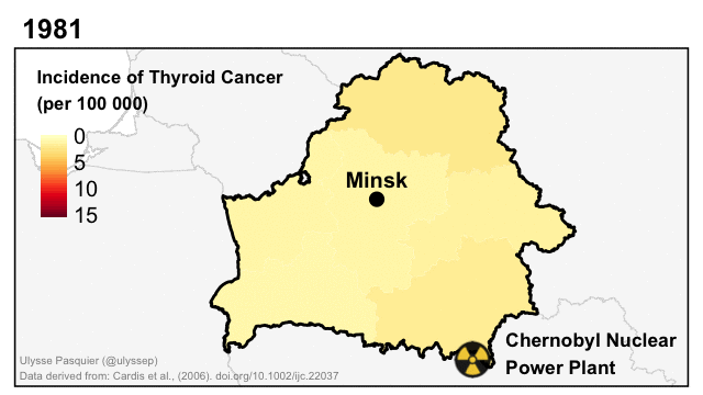
The above animated map shows the incidence of thyroid cancer in Belarus from 1981 to 2002. It was created in R using the tmap and sf packages, with data from Cardis et al. (2006). The code to create the animation is the following:
# Packages

library("sf")
library("tmap")

# Data

## Free GIS country admin boundaries data downloadable at: https://www.diva-gis.org/gdata

belarus0 <- read_sf(dsn = "BLR_adm0.shp") # Country-level boundaries
belarus1 <- read_sf(dsn = "BLR_adm1.shp") # Region-level boundaries
russia <- read_sf(dsn = "RUS_adm0.shp")
ukraine <- read_sf(dsn = "UKR_adm0.shp")
lithuania <- read_sf(dsn = "LTU_adm0.shp")
latvia <- read_sf(dsn = "LVA_adm0.shp")
poland <- read_sf(dsn = "POL_adm0.shp")

nghbr_cntrs <- rbind(russia, ukraine, lithuania, latvia, poland)

## Point Data

## Chernobyl
## Radioactivity Icon found online; https://cdn.pixabay.com/photo/2012/04/24/11/24/radioactive-39417_960_720.png

lat <- 51.389167
lon <- 30.099444

chernobyl_df <- data.frame(lat, lon)
chernobyl_sf <- st_as_sf(chernobyl_df, coords = c("lon","lat"), crs = st_crs(4326))

## Minsk City
lat <- 53.9
lon <- 27.566667
name <- "Minsk"

minsk_df <- data.frame(lat, lon, name)
minsk_sf <- st_as_sf(minsk_df, coords = c("lon","lat"), crs = st_crs(4326))


## Thyroid Cancer Incidence in Belarus Regions
## The final animation was created with data derived from Cardis et al. (2006) available at: doi.org/10.1002/ijc.22037
## For this example I will use random dummy values

regions <- c("Brest", "Homyel'", "Hrodna", "Minsk", "Mahilyow", "Vitsyebsk")
years <- 1981:2002
data <- data.frame("Year" = rep(years, times = length(regions)),
		"NAME_1" = rep(regions, each = length(years))
		)
data$value <- runif(nrow(data), 0, 15)

data_sf <- merge(belarus1, data, by = "NAME_1")

# Mapping
## I chose here {tmap} to test its tmap_animation() as an alternative to {gganimate} to create a GIF.

author <- tm_credits(
	"Ulysse Pasquier (@ulyssep) \nTHIS IS AN EXAMPLE WITH DUMMY DATA",
	position = c("LEFT", "BOTTOM"),
	alpha = 0.5,
	size = 0.2)

bbox <- c(xmin = 22.10005, xmax = 31.70231, ymin = 51.06957, ymax = 56.16836), crs = st_crs(4326))

layout <- tm_layout(
	main.title.fontface = "bold",
	main.title.size = 0.5,
	legend.position = c(0.03,0.45),
	legend.title.size = 0.4,
	legend.title.fontface = "bold",
	legend.text.size = 0.4,
	legend.width = 3)

radioactive <- tm_symbols(
	shape = tmap_icons(file = "https://cdn.pixabay.com/photo/2012/04/24/11/24/radioactive-39417_960_720.png", width=47, height=48),
	size = 0.08,
	border.lwd = NA)

## Single year (frame) preview

data_sf1981 <- data_sf[data_sf$Year == "1981",]

map1981 <-
	tm_shape(data_sf1981, bbox = st_bbox(bbox) +
		tm_polygons("value", title = "Incidence of Thyroid Cancer \n(per 100 000)",
			    palette = "YlOrRd",
			    style = "cont",
			    breaks = c(0, 5, 10, 15),
			    lwd = NA) +
		tm_facets(free.scales.fill = FALSE, ncol = 1, nrow = 1, along = "Year") +
		layout +
		author +
	tm_shape(nghbr_cntrs) +
		tm_polygons(col = "grey97", border.col = "grey85", lwd = 0.3) +
	tm_shape(belarus0) +
		tm_borders(col = "black", lwd = 0.9) +
	tm_shape(minsk_sf) +
		tm_symbols(col = "black", border.lwd = NA, size = 0.1) +
		tm_text("name", ymod = 0.3, fontface = "bold", size = 0.4)+
	tm_shape(chernobyl_sf) +
		radioactive +
		tm_credits("Chernobyl Nuclear \nPower Plant", position = c(0.72, 0.01), fontface = "bold", size = 0.35)

## tmap_save(map1981, filename = "map1981.pdf", width = 640, height = 360)

## Full animation

animation <-
	tm_shape(data_sf, bbox = st_bbox(bbox) +
		tm_polygons("value", title = "Incidence of Thyroid Cancer \n(per 100 000)",
			    palette = "YlOrRd",
			    style = "cont",
			    breaks = c(0, 5, 10, 15),
			    lwd = NA) +
		tm_facets(free.scales.fill = FALSE, ncol = 1, nrow = 1, along = "Year") +
		layout +
		author +
	tm_shape(nghbr_cntrs) +
		tm_polygons(col = "grey97", border.col = "grey85", lwd = 0.3) +
	tm_shape(belarus0) +
		tm_borders(col = "black", lwd = 0.9) +
	tm_shape(minsk_sf) +
		tm_symbols(col = "black", border.lwd = NA, size = 0.1) +
		tm_text("name", ymod = 0.3, fontface = "bold", size = 0.4)+
	tm_shape(chernobyl_sf) +
		radioactive +
		tm_credits("Chernobyl Nuclear \nPower Plant", position = c(0.72, 0.01), fontface = "bold", size = 0.35)

## Saving animation
## Where tmap_save() gives control over the output's resolution, I couldn't find the same for tmap_animation. Default seems to be dpi = 300.

tmap_animation(animation, filename = "chernobyl_thyroid.gif", width = 640, height = 360, delay = 6, restart.delay = 150)
Inspired by the brilliant mini-series #ChernobylHBO from @clmazin to practice with #dataviz:
— Ulysse Pasquier (@ulyssep) June 19, 2019
Incidence of Thyroid Cancer in Belarus (1981-2002). The Chernobyl accident occurred on April 26th 1986.
Made in 🖥️#rstats🗺️#tmap #sf with data from https://t.co/WQJf5U3tZN #datascience pic.twitter.com/H56OfYHMUX
Ulysse Pasquier
Researcher in Hydrology and Climate Change Adaptation
My research focuses on the impacts of climate change and human activity on hydrology and water resources.